Upgrade Flow Redesign
Reducing friction in the path from free to paid without the hard sell.
Head of Design · Oct 2024
47% of users abandoned Neon's upgrade flow mid-way through. Only 15% converted to any paid tier within their first week. 2% reached Business. The product wasn't the problem. Users couldn't make sense of what they were being asked to decide.
I redesigned the upgrade experience end to end. Clearer tier hierarchy, smarter defaults, reduced confirmation steps. The goal was to make upgrading feel like a confident decision, not a commitment to something they didn't fully understand.
The Problem
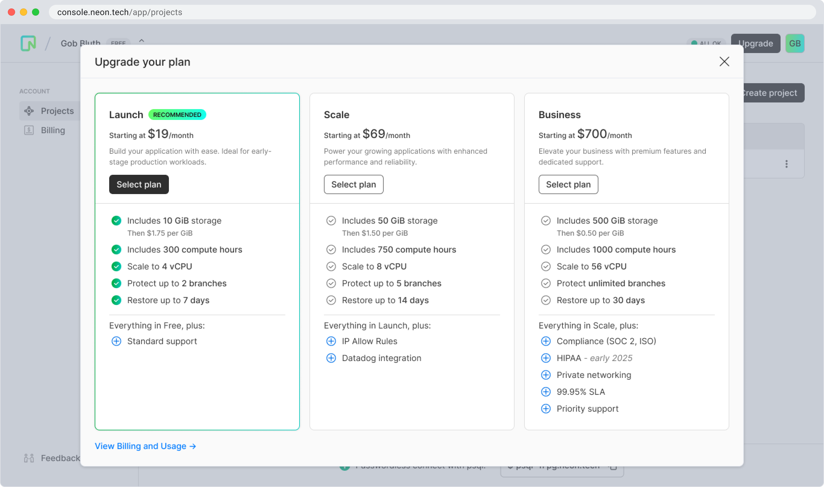
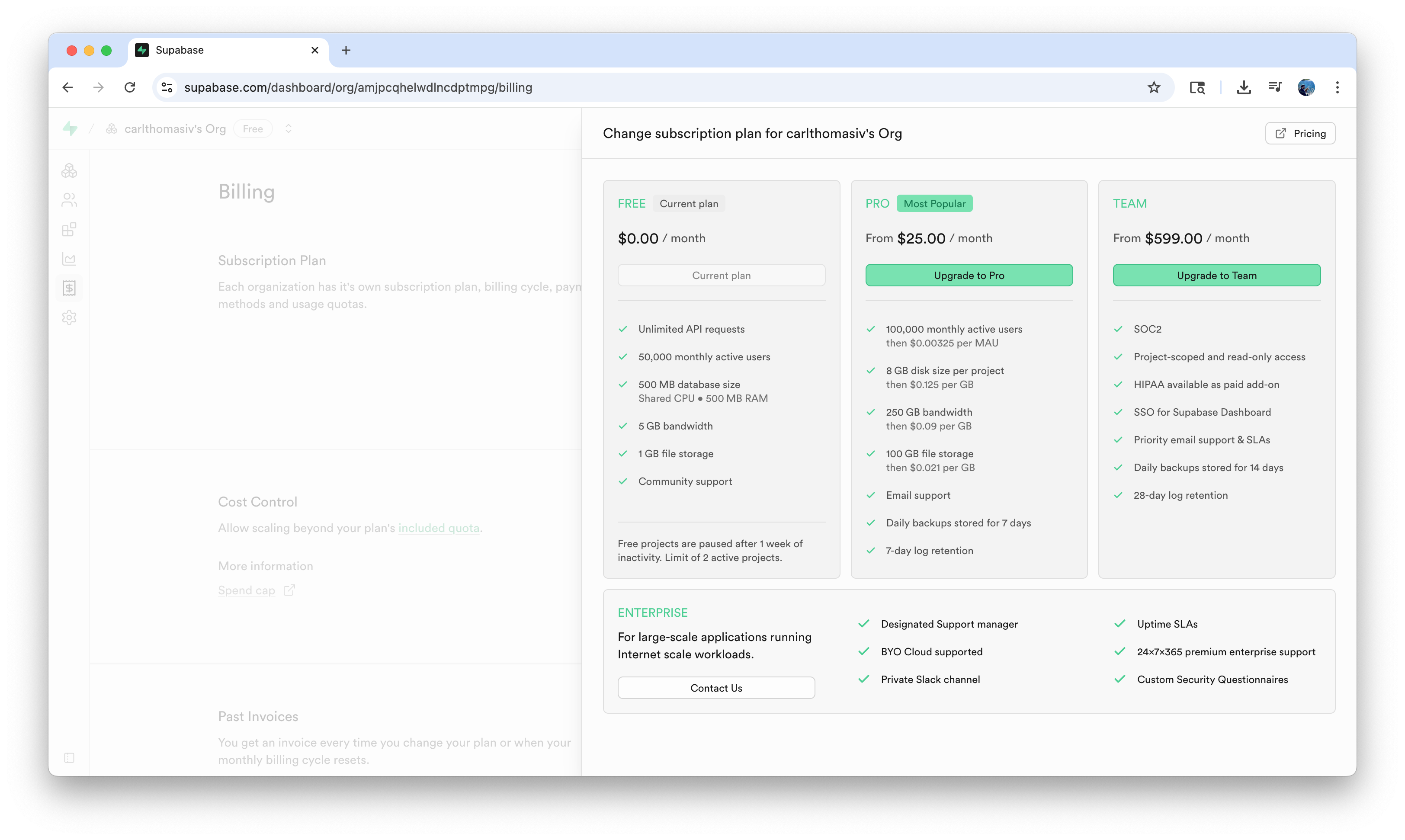
The original upgrade flow blended all pricing tiers together with weak visual distinction. No clear hierarchy. Value propositions that didn't map to what users actually cared about. A multi-step process that required selecting a tier, clicking upgrade, then confirming again before anything happened.
Users weren't hesitating because they didn't want to pay. They were hesitating because the flow gave them no confidence they were making the right choice.
The original modal. Tiers blended together, weak hierarchy, no clear path to Business.
Goals
User Goals
Business Goals
Hypothesis
If we increase the distinction between pricing tiers and clarify the value of each, especially Business, we will drive higher upgrade confidence and improve trial-to-paid conversion.
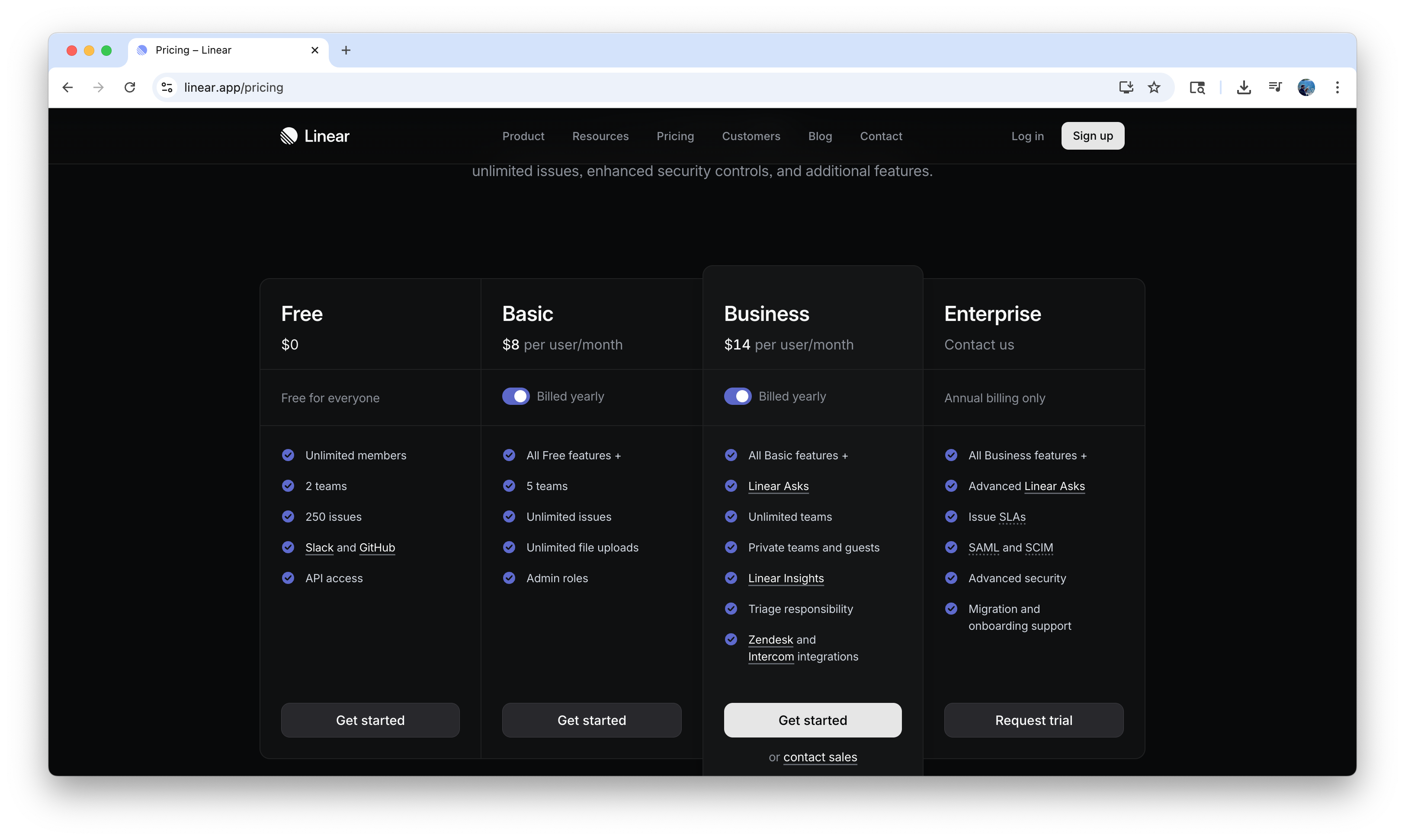
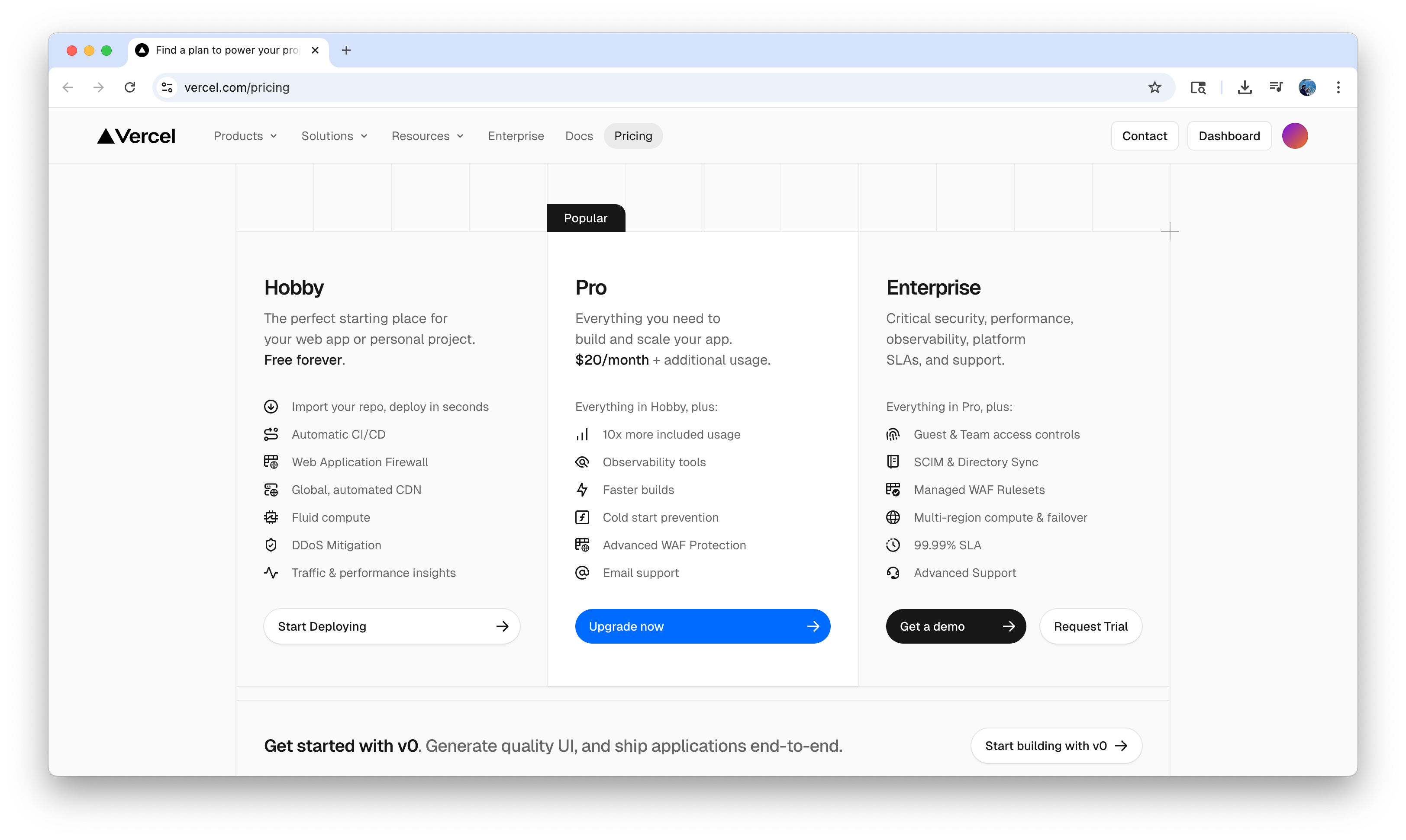
Competitive Analysis
I audited upgrade and pricing flows across 8 SaaS products to understand what the best ones got right. A few clear patterns emerged:

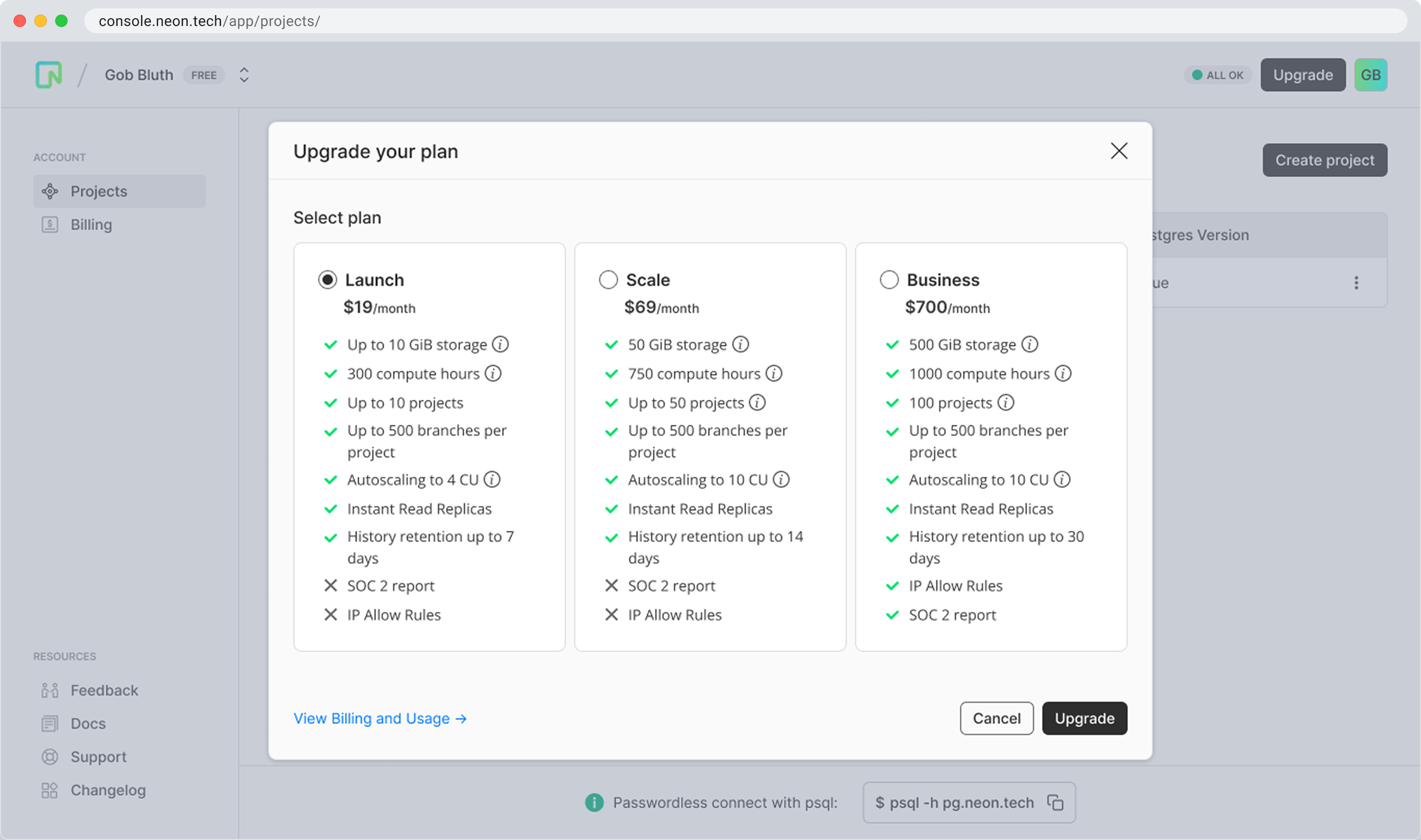
The Solution
The redesigned modal consolidated the upgrade experience into a single, focused view. Strong type hierarchy separated tiers clearly. A recommended tag surfaced based on user behavior. Current usage visible before committing. One fewer step to complete the upgrade.
Outcomes
Released October 2024.
Learnings
Pricing flows are trust moments as much as conversion moments. Users aren't just deciding whether to pay. They're deciding whether they believe the product will deliver. Every element that reduces clarity is a vote against confidence.
The recommended tag was the highest-leverage single change. Giving users a signal that someone had already thought about the right choice for them removed decision paralysis without removing agency. Small surface area, meaningful impact.
This work ended up shaping more than the modal. The hierarchy and framing we landed here became the reference point when Marketing and Billing rebuilt their pricing pages. That kind of upstream influence is what separates tactical design from strategic design.