Learning Hub
A developer-first education portal built to reduce time-to-value across Konnect.
Senior Staff Product Designer · Jul 2024
Kong Konnect offers powerful API gateway infrastructure, but I identified a critical gap: users arrived with no onboarding support, no in-app guidance, and no way to quickly understand what the platform did or why it mattered. The product assumed knowledge most new users were still building.
I designed the Learning Hub — an in-app education system embedded directly in the console, built to meet users where they were confused rather than sending them elsewhere to figure it out. Delivered across 3 milestones over 3 months as Staff Product Designer, Growth.
Background
Kong Konnect Gateway is an API gateway that helps organizations securely manage, route, and monitor API traffic across services. It provides key capabilities like traffic control, authentication, rate limiting, and observability — designed to help teams scale services reliably and efficiently.
Before Kong
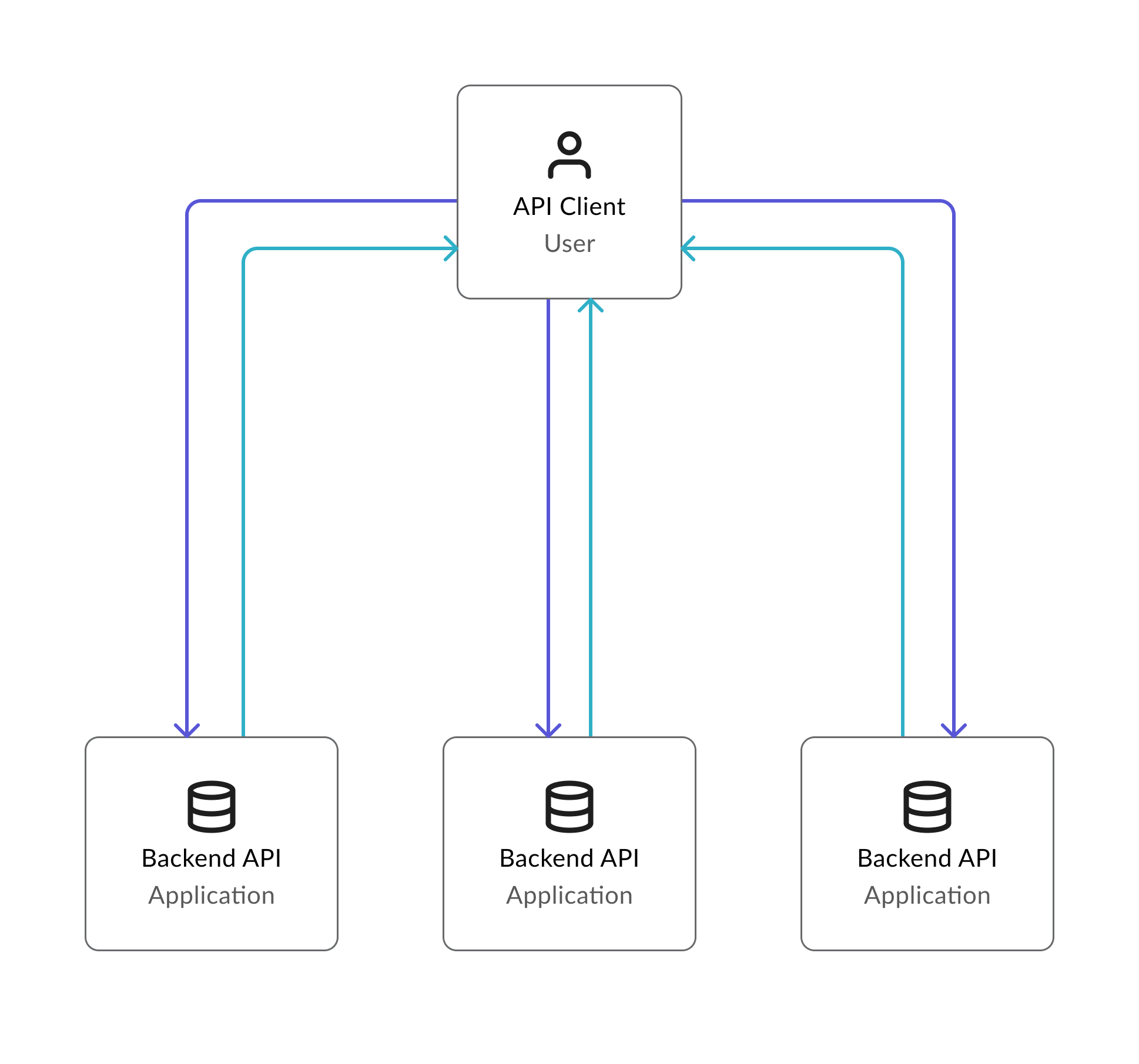
Developers had to manually build and maintain complex systems to connect and protect APIs. This slowed teams down and increased the risk of errors at every layer.
After Kong
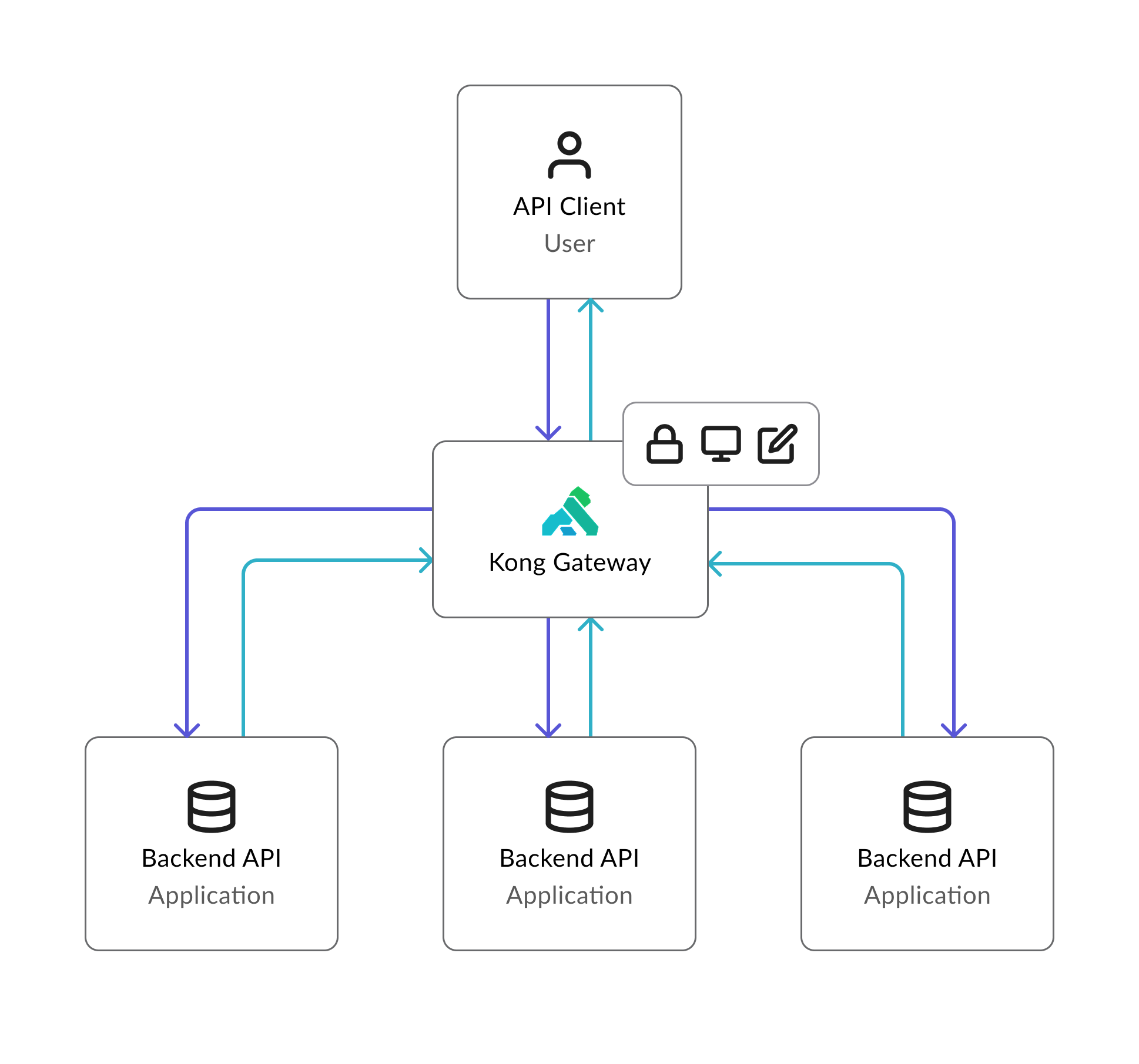
With a Kong Gateway you have a traffic controller for your APIs. It manages, secures, and routes data between services so apps run smoothly and reliably — without the custom plumbing.
The Problem
Gateways help teams move faster and build more reliable software — but only once they understand them. That gap was exactly where Konnect was losing users.
Where we were before
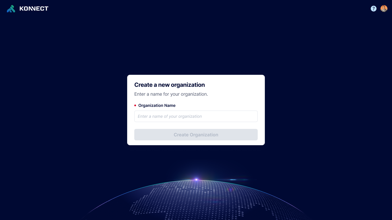
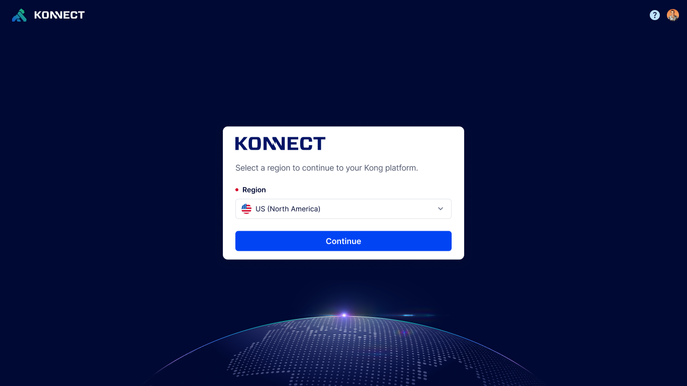
When new customers signed up for Konnect they were greeted with the main overview page. No next steps. No context. No acknowledgment that they were new.
Along with this, new customers were often confronted with terminology they had not yet internalized. Gateways, services, routes, plugins — concepts that took time to understand but were assumed from the start.
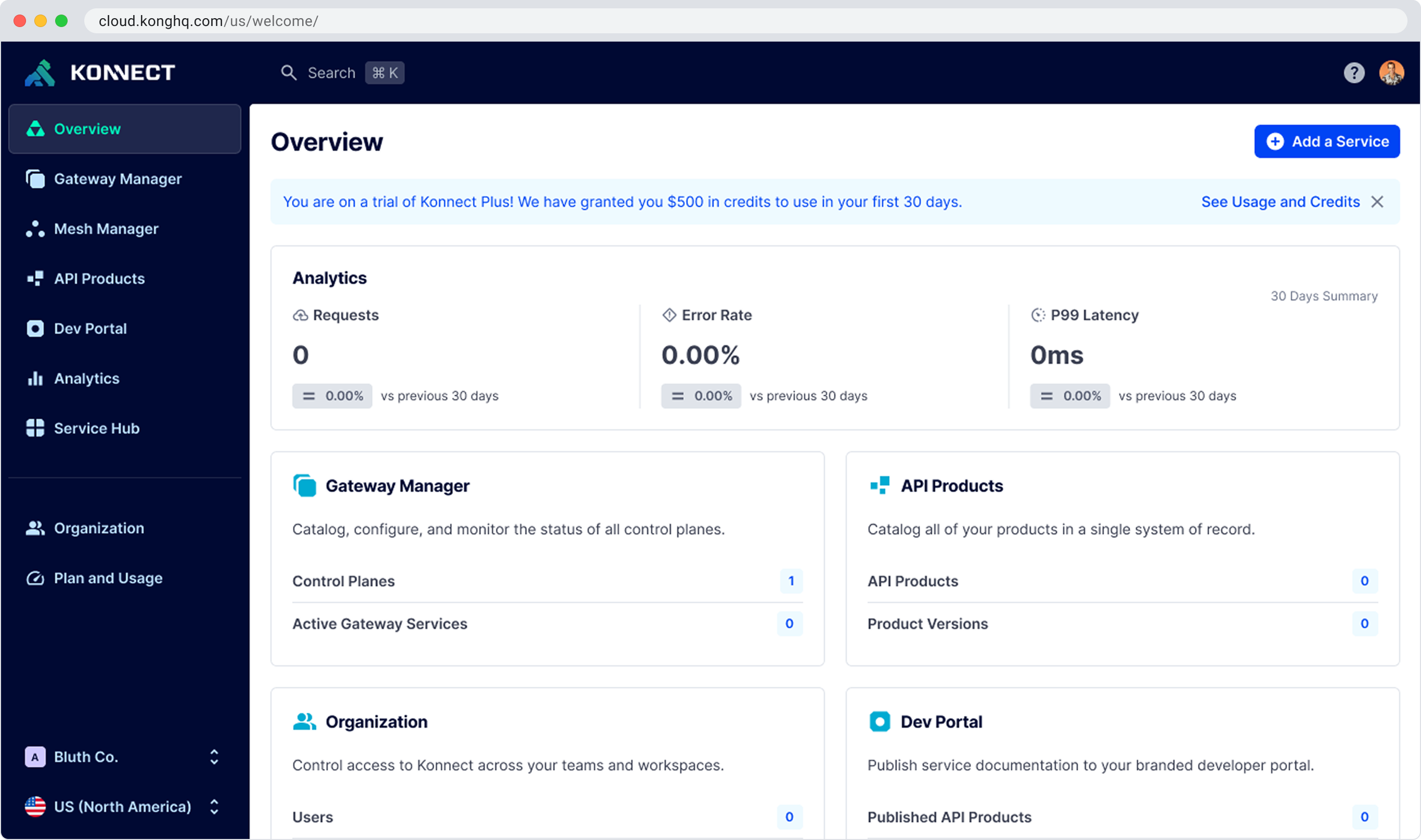
New users landed here — dense, unfamiliar, and with no indication of where to start.
To understand the scale of the problem I analyzed user data and support requests, focusing on where users got stuck and what was preventing successful activation.
90% of users failed to activate within the first week. Over 50% churned. 95% of revenue still came through the sales team. These numbers, based on 1,000+ new orgs created per week, made it clear the product was leaving most users behind before they ever reached the value.
The pattern was consistent: users did not understand Konnect's terms and features. The time to 'a-ha' was too long and too risky. Users who did eventually get it retained quickly. The problem was getting them there.
Competitive Analysis
I reviewed approximately 5 products including direct competitors to understand how they handled in-app learning and onboarding support. Key findings:
Hypothesis
By introducing an in-app Learning Hub with contextual guidance, use case-driven templates, and AI-assisted support, we can reduce onboarding friction, empower users to become self-sufficient faster, and drive higher activation and adoption. Lowering support costs and laying the foundation for Konnect to become a true API co-pilot.
Goals
User Goals
Business Goals
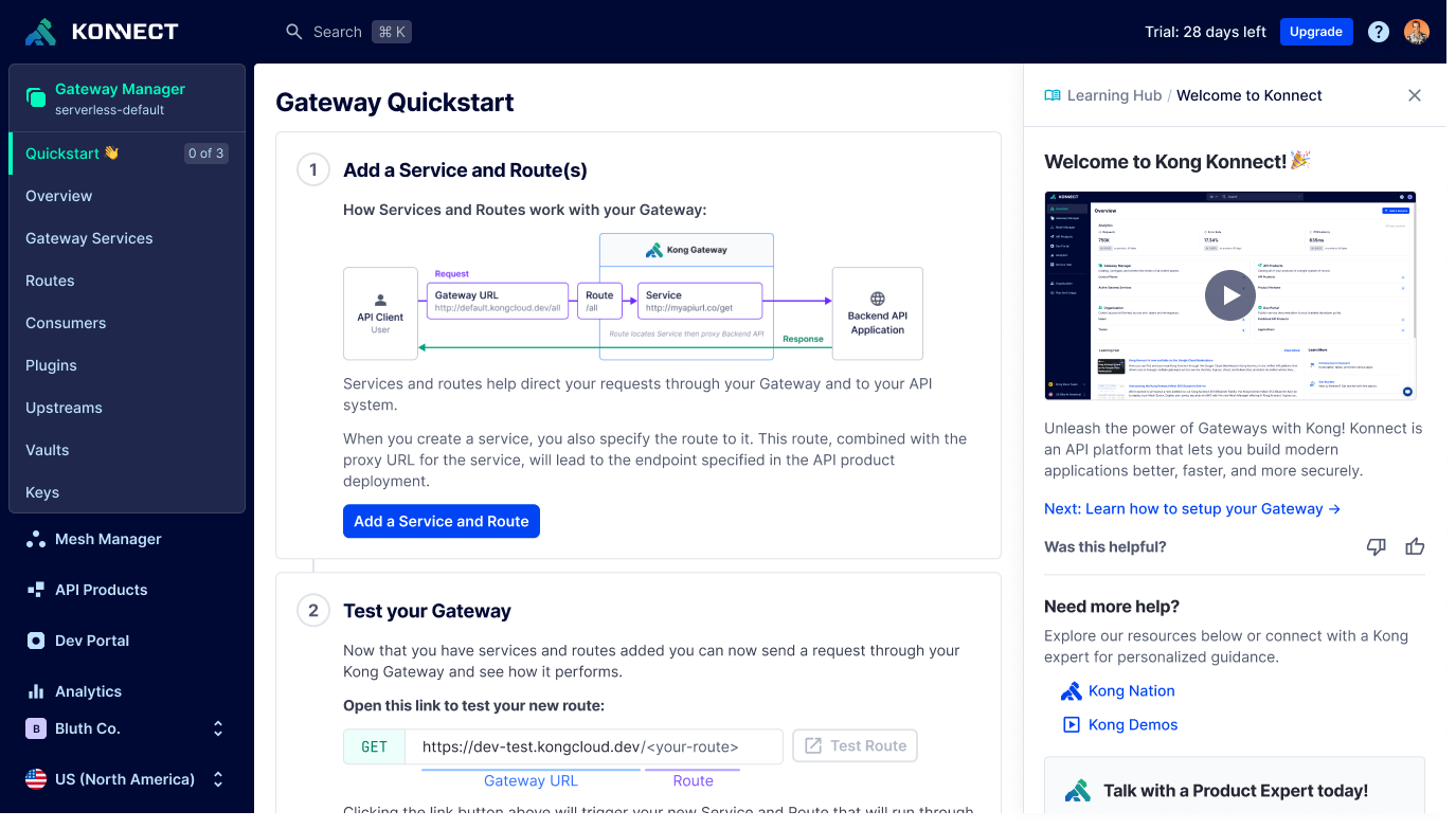
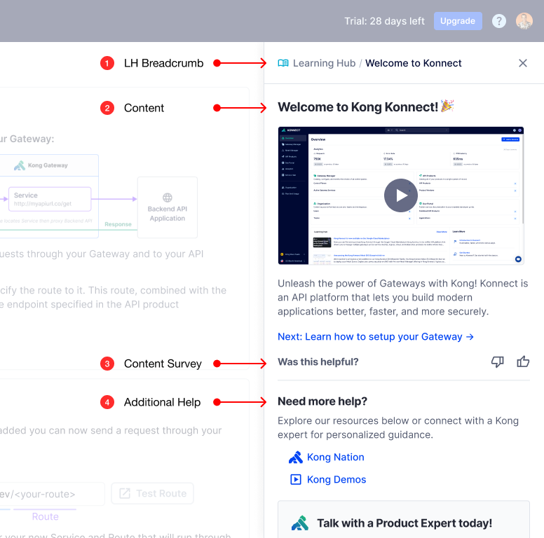
Flow 1: Welcoming New Users
The initiative was scoped across multiple milestones — each expanding the hub's capabilities and incorporating feedback from the previous iteration. Flow 1 focused on the welcome experience: getting new users oriented, contextualizing the product for their use case, and giving them a clear path forward from day one.
Before designing anything I mapped Konnect's core concepts — what we called foundations — against the apps and features built on top of them. The goal was to understand when and how to surface meaningful steps for users to be successful with Kong gateways.
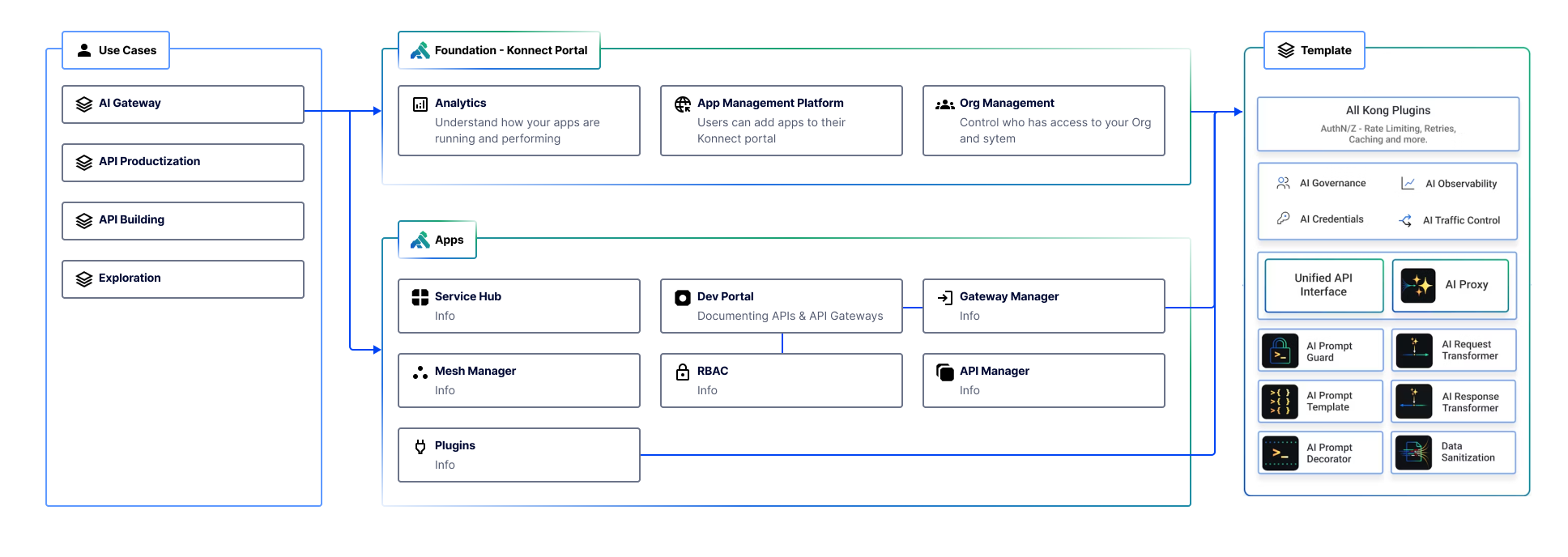
From there I developed a content strategy for the Learning Hub, working closely with the docs team to determine what information needed to live inside the product versus when to hand users off to external documentation.
Flow 1 designed the welcome experience for new users — from signup through to their first gateway. The designs below show the full flow:
A key part of the welcome experience was helping customers understand what Kong offers and that the platform was there for them. I worked closely with Senior Director of DevRel, Michael Heap, to produce a welcome video that captured Kong's value and how easy it was to get started. Goals for the video:
Learning Hub component anatomy
The Learning Hub pattern provides a structured and accessible in-app learning environment, designed to optimize user understanding and support. Key components include:
Flow 2: Product-Wide Assistance
A key challenge in Konnect was that users often struggled to grasp its features and terminology, which slowed them down across the entire product. Milestone 1 tackled this by integrating a global Learning Hub — a deliberate design choice to meet users wherever they were, not just at signup.
Instead of bouncing users out to external documentation, I collaborated with the docs team to reshape content for in-app delivery — emphasizing conciseness and user-friendliness. This work covered approximately 18 different features and pages across the console. The grid below shows the hub across 6 of those features — each with its own contextual content, not a generic help panel.
Outcomes
Milestone 1 released July 2024. The initial framework established the strategic direction for the Learning Hub and created a scalable, adaptable system that became the foundation for future growth.
Learnings
The hardest part wasn't the UI. It was the content strategy. Deciding what to say, how much to say, and when to say it required as much design thinking as the component itself. Documentation that works in a docs site does not automatically work inside a product.
The needs survey at signup was one of the most important decisions we made. Personalizing the hub based on use case meant users arrived at content that felt relevant rather than generic. It also gave us a signal we could use to improve over time.
Building with handoff in mind paid off. The system I shipped was intentionally extensible. The fact that another designer was able to take it further without rebuilding it from scratch was a validation of the architecture decisions, not just the visual ones.