Console Navigation
Restructuring the mental model for a multi-tenant cloud console.
Head of Design · May 2025
Neon was signing up 60,000 new developers every week. 15% dropped off immediately after arriving. 40% of support tickets were navigation-related. The console was organized around how the product was built internally, not how developers think about their work. That gap was the problem.
I led the navigation redesign end to end. Set the long-term architecture vision first. Shipped Milestone 1 in a single quarter to prove the direction. Built the cross-functional alignment to carry it through multiple phases.
The Problem
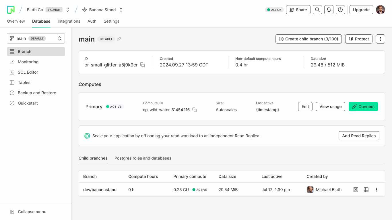
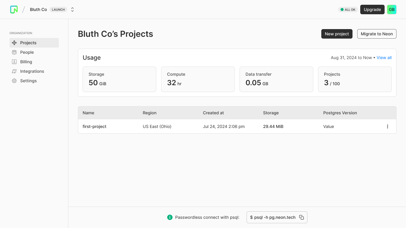
Neon's navigation treated every feature with equal weight. No hierarchy. Branches inconsistently surfaced or buried depending on context. The structure mirrored backend architecture, not developer workflows. Users arrived expecting to connect data and start building. Instead they spent time figuring out where they were.
The numbers confirmed it. 15% of users dropped off immediately after signup. Only 30% engaged with key features like Auth and Monitoring. The nav wasn't a minor usability issue. It was blocking activation.
Why the IA Wasn't Working
What developers saw
What it needed to be
What We Heard
User feedback from HubSpot transcripts and support tickets surfaced three consistent themes:
Felt like a step backward in usability.
Why was a branch created with my name on it?
I had no idea where to go next.
Orientation breakdowns. Low branch adoption. High early churn. The navigation wasn't just confusing. It was undermining confidence in the product itself.
Goals
User Goals
Business Goals
Setting the Vision
Before shipping anything, I needed to set the long-term direction. The existing structure exposed org, project, and branch-level actions without clear separation. Developers were navigating across three conceptual levels with no hierarchy.
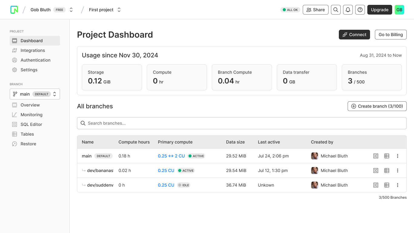
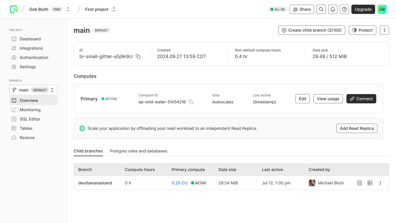
The proposed architecture separated global from contextual actions. Org-level tools at the top. Project structure in the middle. Branch-level workflows in context panels. Everything surfaced where it was relevant, not all at once.
Milestone 1
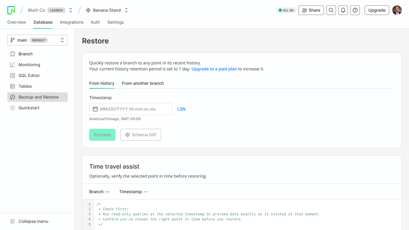
Rather than wait for the full vision, I scoped what would have the most immediate impact. Branch context was the biggest confusion point. Users didn't know which branch they were on, how to switch, or how environments related to each other.
Milestone 1 shipped in one quarter. Persistent branch context in the side panel. Clear entry points for switching and creating branches. A simplified project structure that reflected how developers actually move through their work.
Outcomes
Milestone 1 released May 2025. Early signals within the first month:
It's finally clear which branch I'm in and how to switch. Game changer.
Neon user
Learnings
Navigation is invisible when it works. That's the goal, but it makes it a hard case to build internally. The path to buy-in was shipping something fast that proved the direction before asking for commitment to the full vision.
The IA work was as important as the UI work. Getting cross-functional agreement on how org, project, and branch contexts related to each other required as much facilitation as design. Alignment on language and hierarchy came before the first pixel.
The most useful thing I did early was name what we were optimizing for. Not better navigation. Reducing orientation overhead. That framing gave PM and engineering a way to evaluate decisions without relitigating the problem every time a tradeoff came up.